Curiosity driven visual designer
Prendersi Cura
4th edition celebration
Client
Sambre Collective
Role
Visual identity designer
Sambre is a photography collective whose latest open call, Prendersi cura, invites photographers to explore care in its broadest and most layered sense, not as therapy or repair, but as attention, presence, and relational responsibility. The visual identity is built around a single organic metaphor: a mold, or fungi, expanding from the logotype and other hotspots. Like care itself, slime molds have no center, no hierarchy, no fixed boundary, they grow by touch, spreading wherever conditions allow life to continue. The form grows as a reminder that acts of care are never isolated: each one propagates another, building webs of relation across bodies, spaces, and communities.
"The care that has been 'passed on' [...] continues to circulate, not necessarily morally or intentionally, in an embodied way, or simply embedded in the world, environments, infrastructures that have been marked by that care."
María Puig de la Bellacasa, Matters of Care, 2017
2026
Prendersi Cura
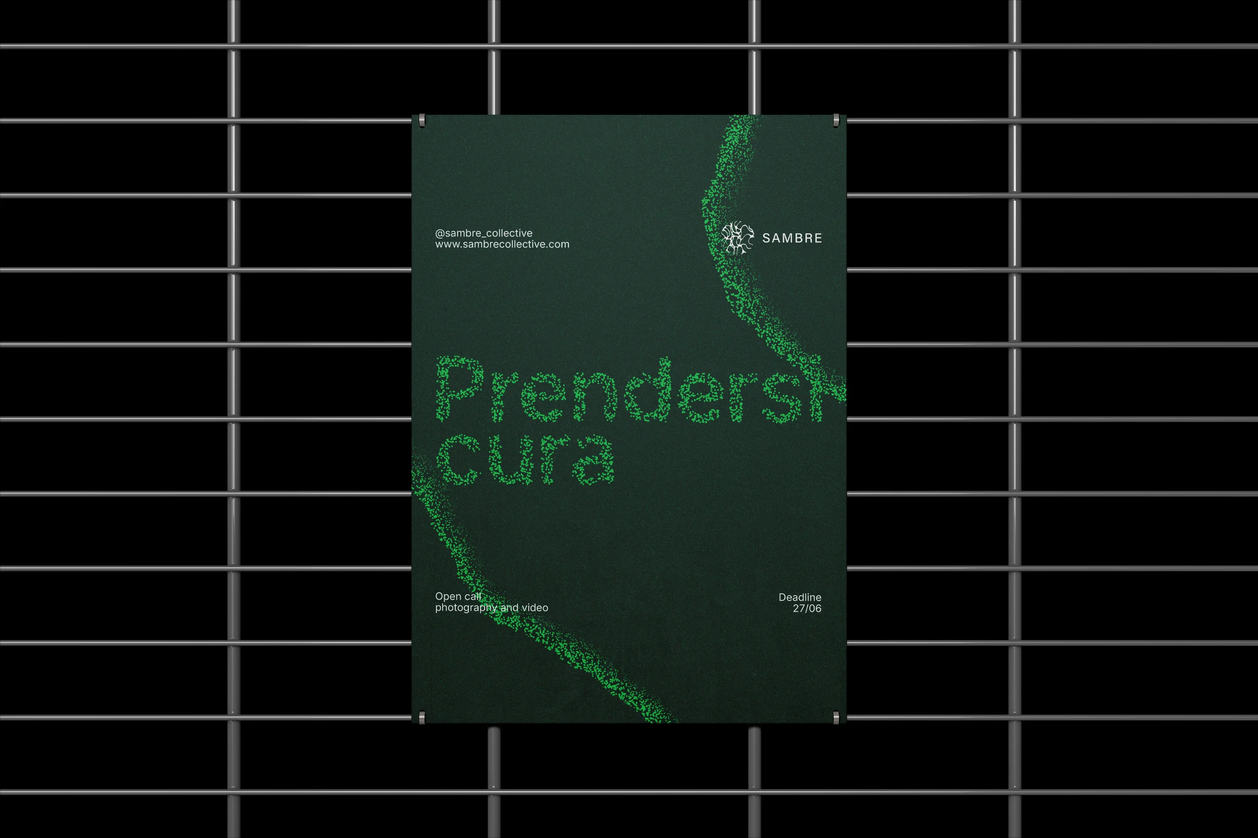
The typographic choice to write the call in lowercase reflects the collective's intent: care as it appears here is not institutional or ceremonial, but everyday and horizontal. It belongs to everyone.
The color palette extends Sambre's existing green identity while introducing a sharp neon green to single out care as something that demands to be seen. Often rendered invisible by the systems that exploit it, care is here made luminous, loud, organic, impossible to overlook.
This project is ongoing, stay tuned for the exhibitions identity!
Client
TEDxSapienzaU
Role
Print designer
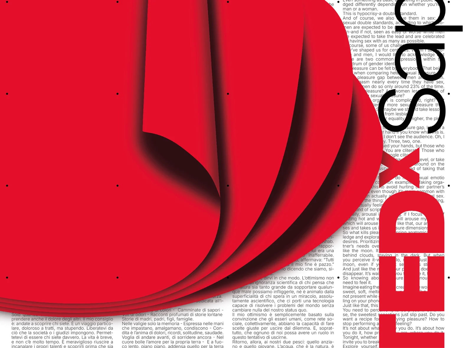
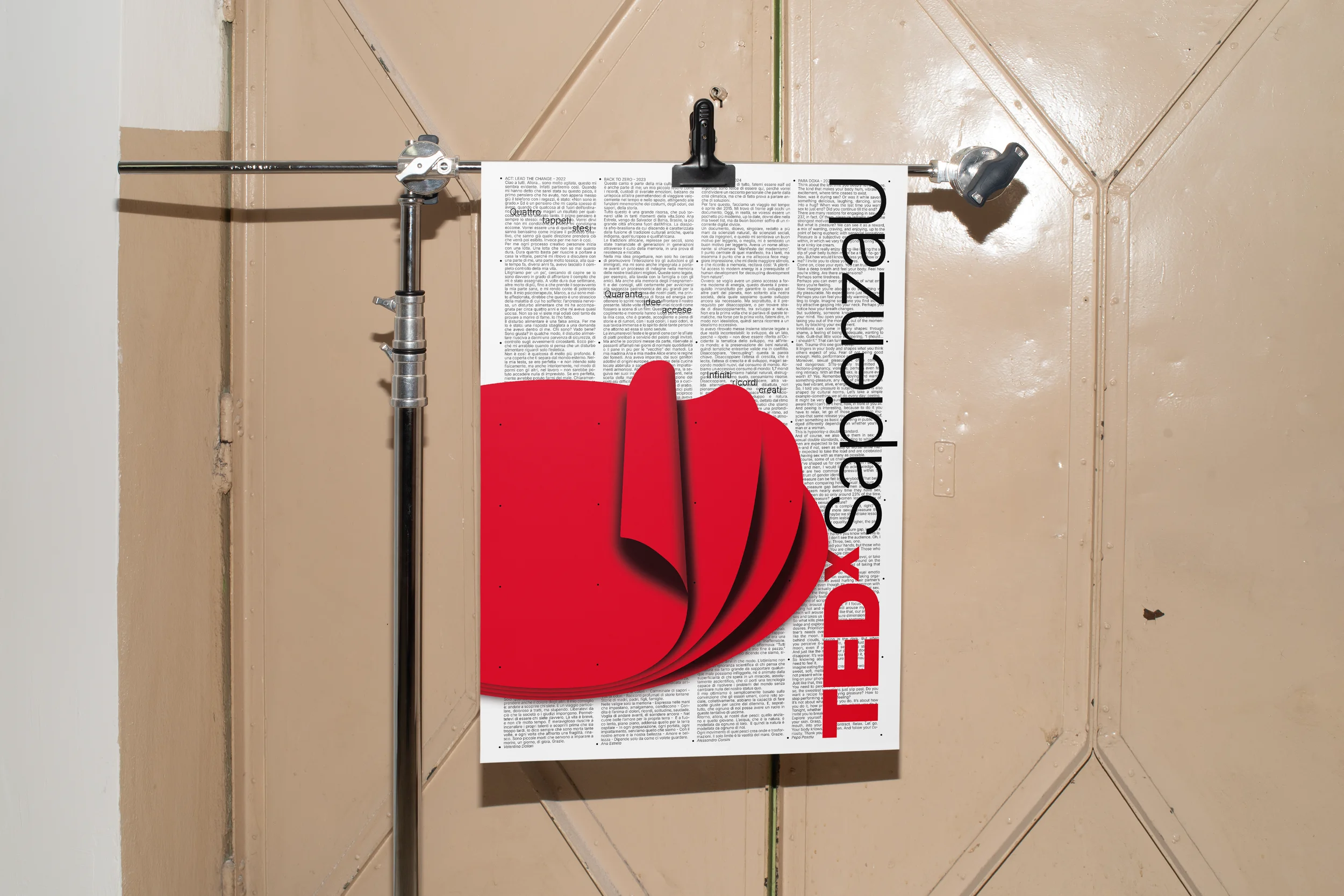
Designed to celebrate the fourth edition of TEDxSapienzaU, this poster speaks to volunteers past and present. A grid of forty dots echoes the forty ideas brought to the stage; four emblematic speeches from past editions serve as backdrop. In the foreground, four red carpets unfold like pages of memory, rolling out as if mid set-up, evoking the hours of work behind the scenes.
2025
4th edition celebration
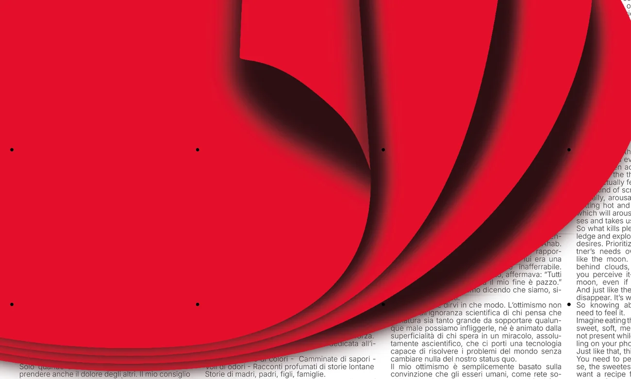
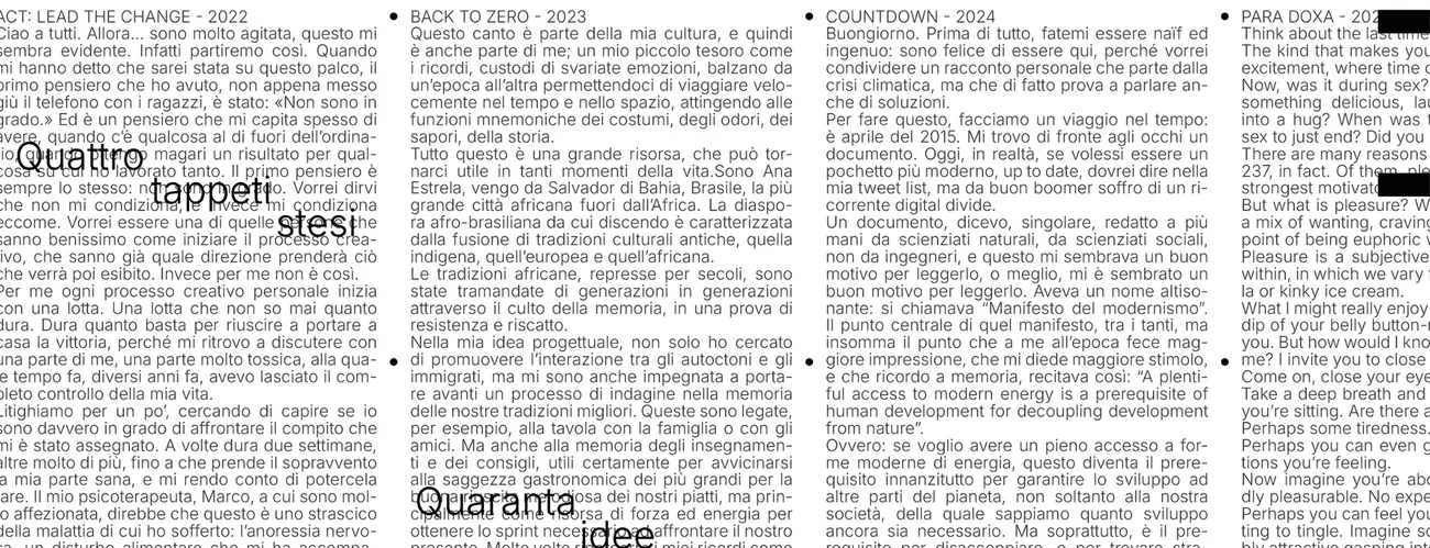
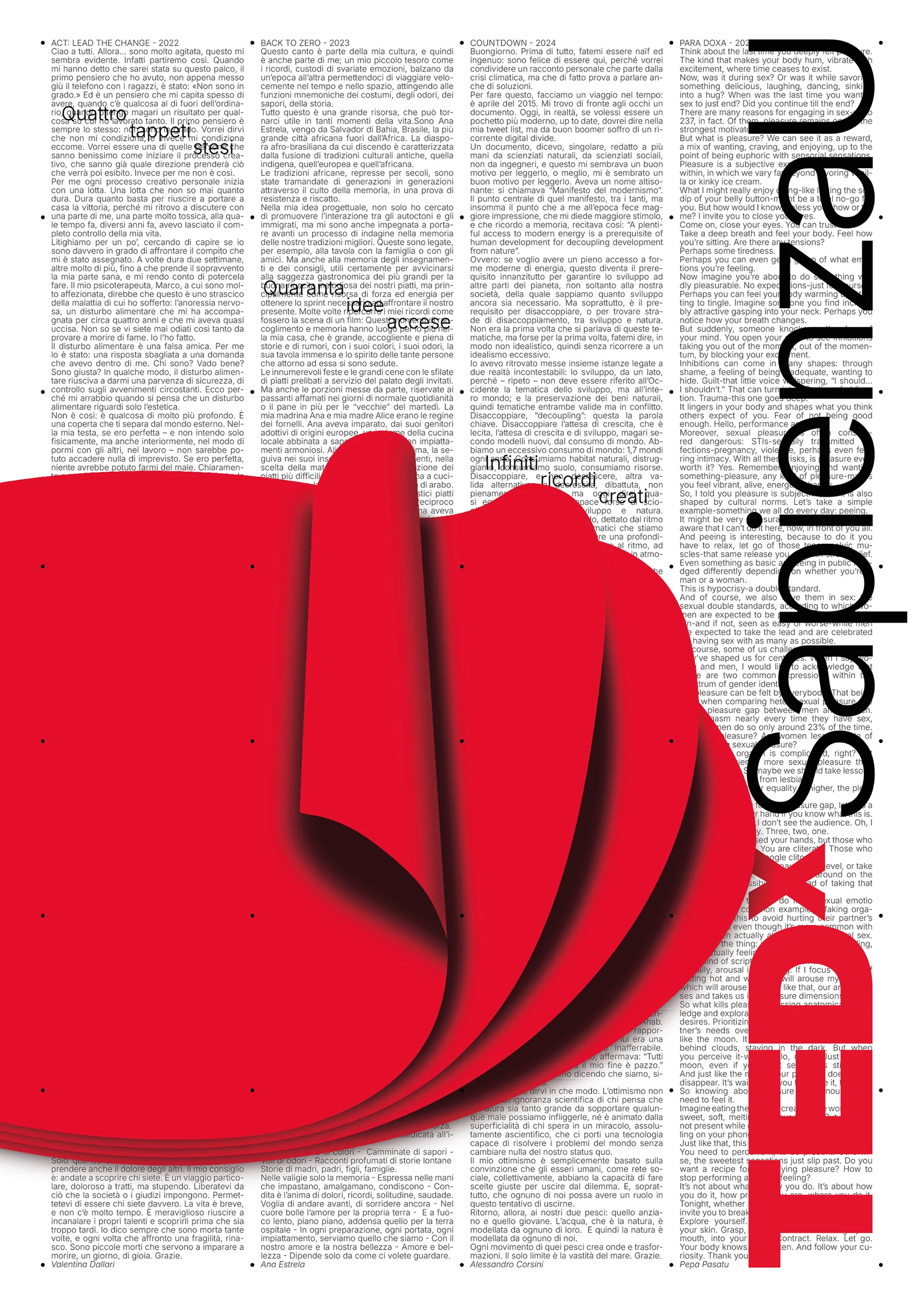
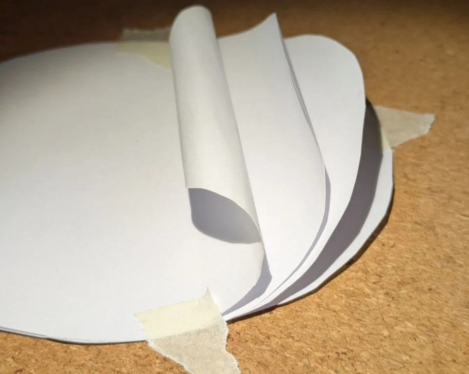
A peek at my process: the picture of a physical model was traced to draw the main protagonist of the composition.
Tuca Tuca
Rossana
Client
University project
Role
Type designer
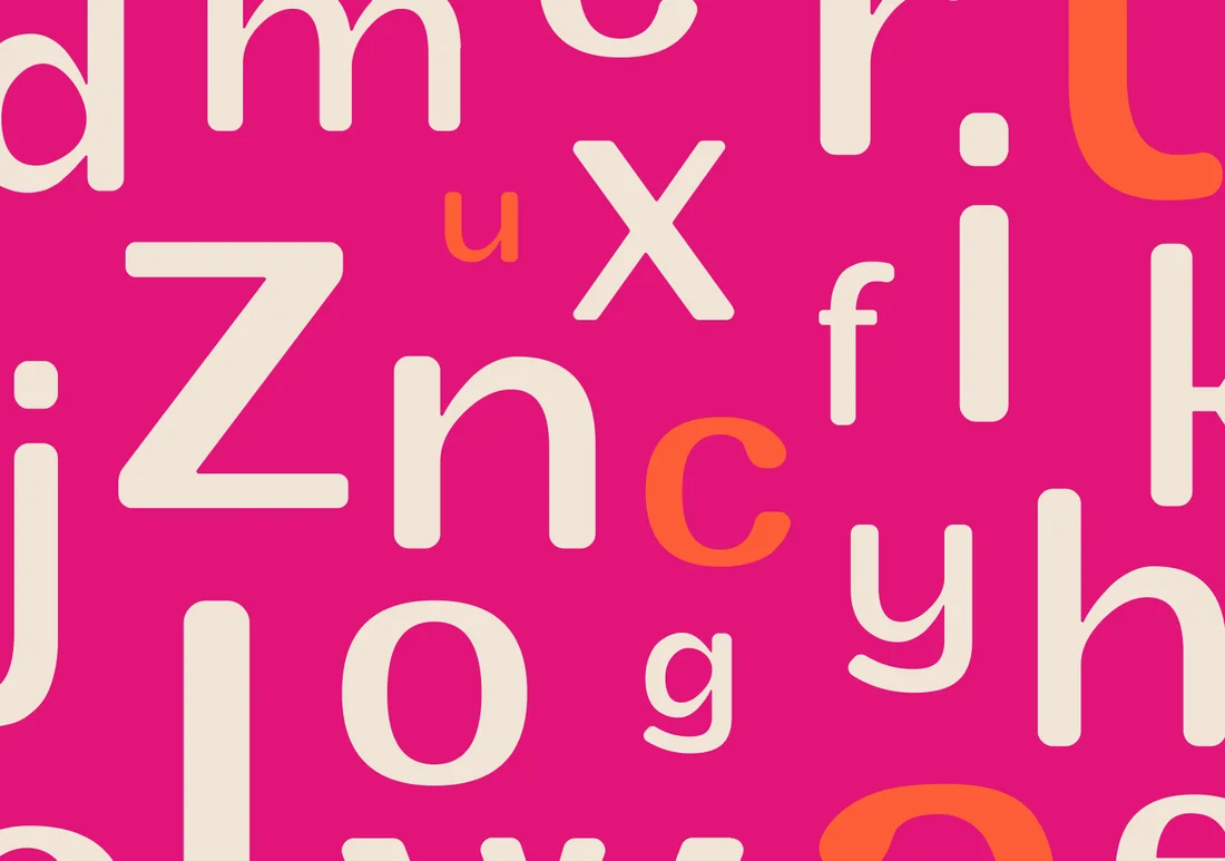
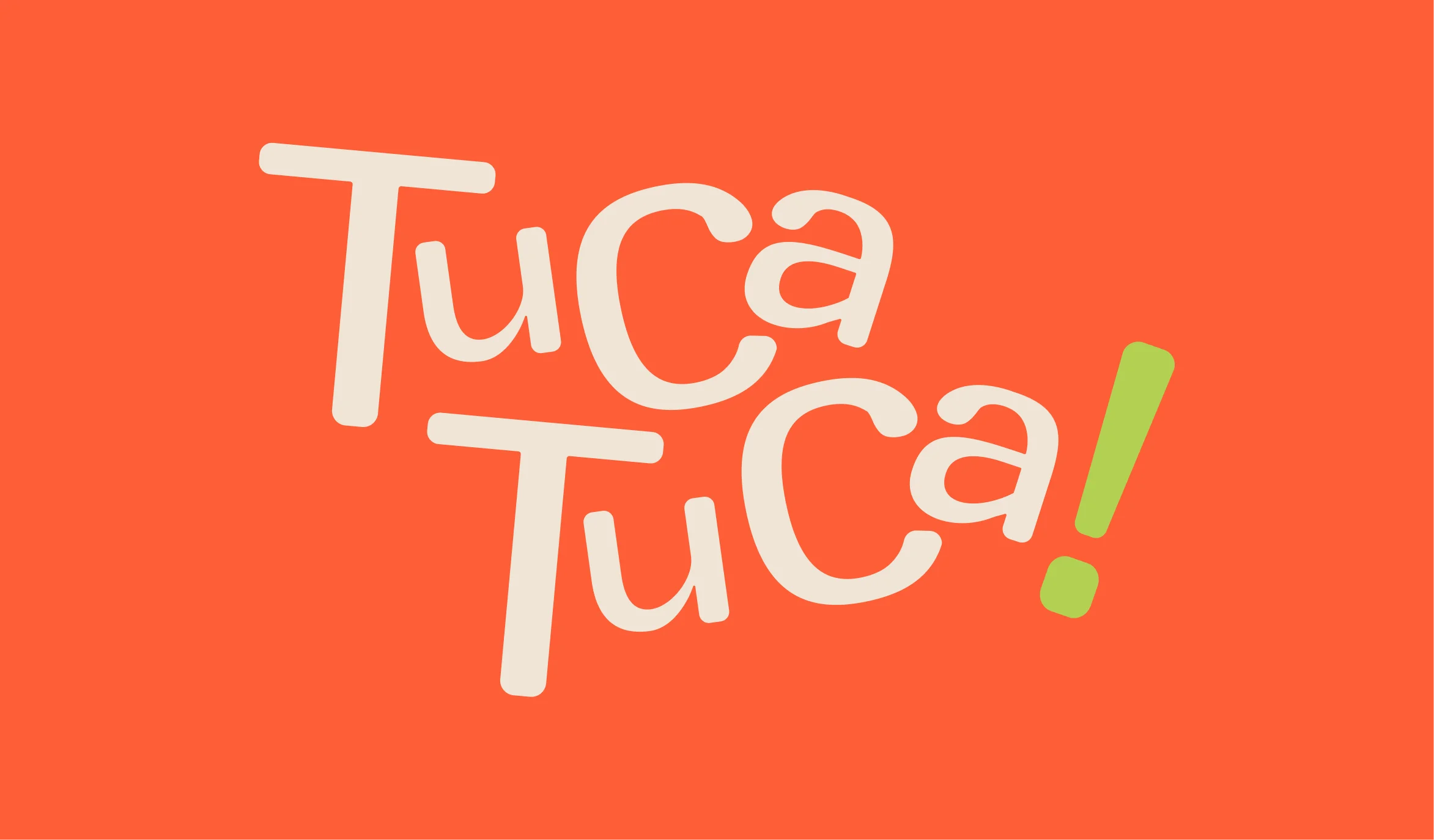
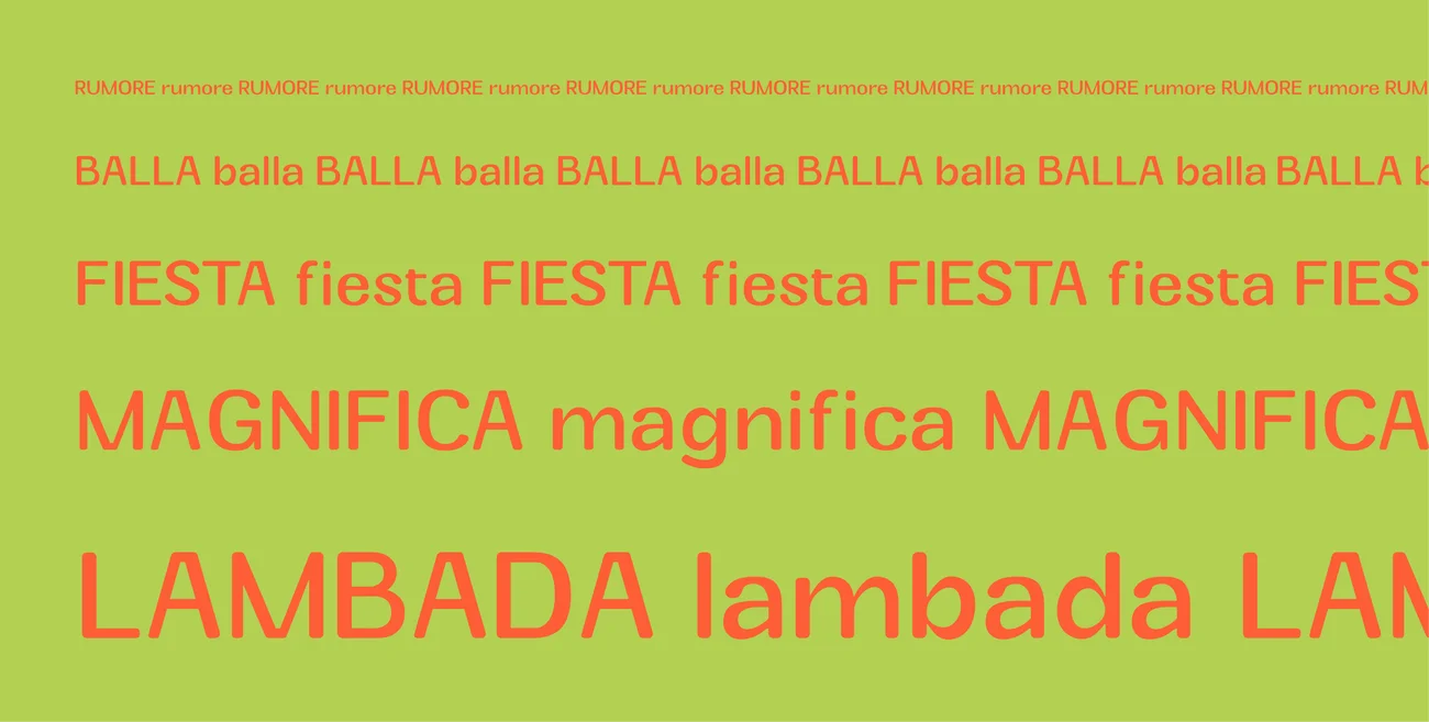
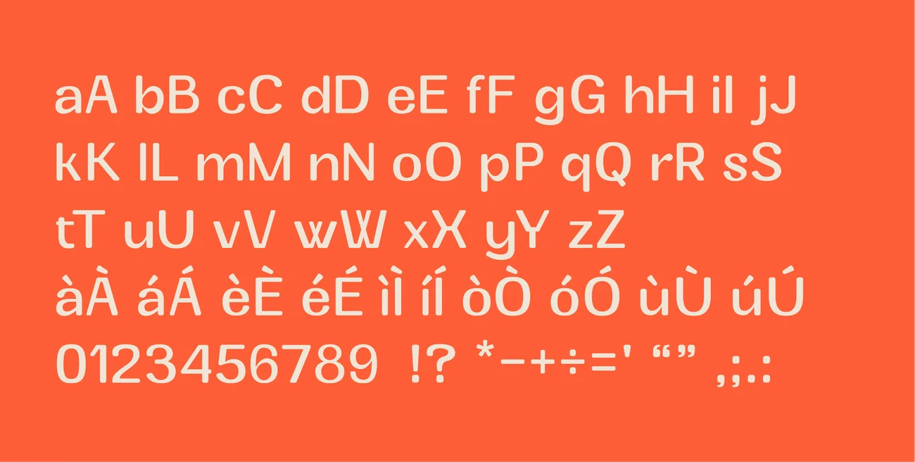
Tuca Tuca is a typeface inspired by the iconic Raffaella Carrà. Her dances, her swinging bob, inspire the shapes of a typeface with a friendly feel and a pleasantly seventies aesthetic.
2025
Tuca Tuca
Client
Rossana, University brief
Role
Graphic designer
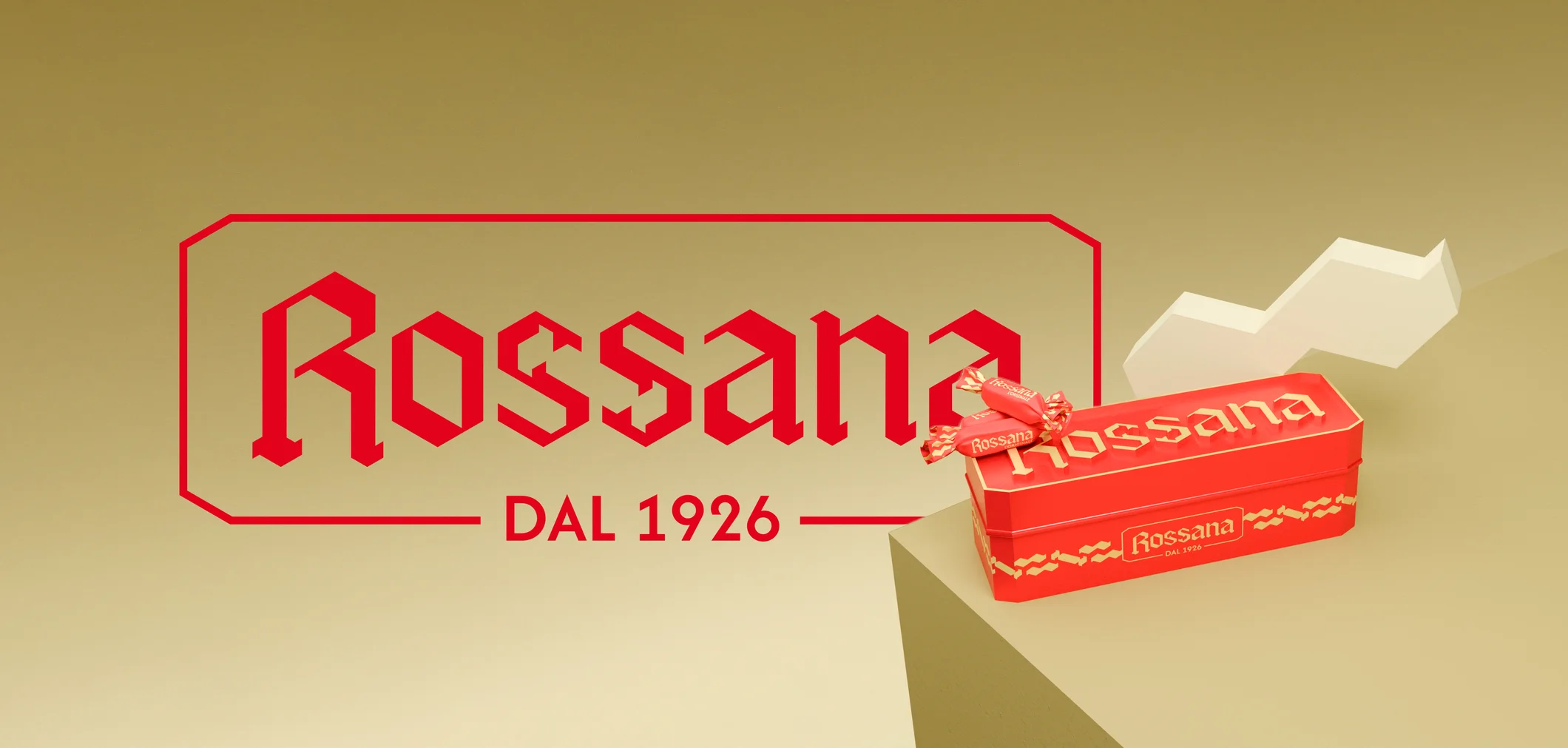
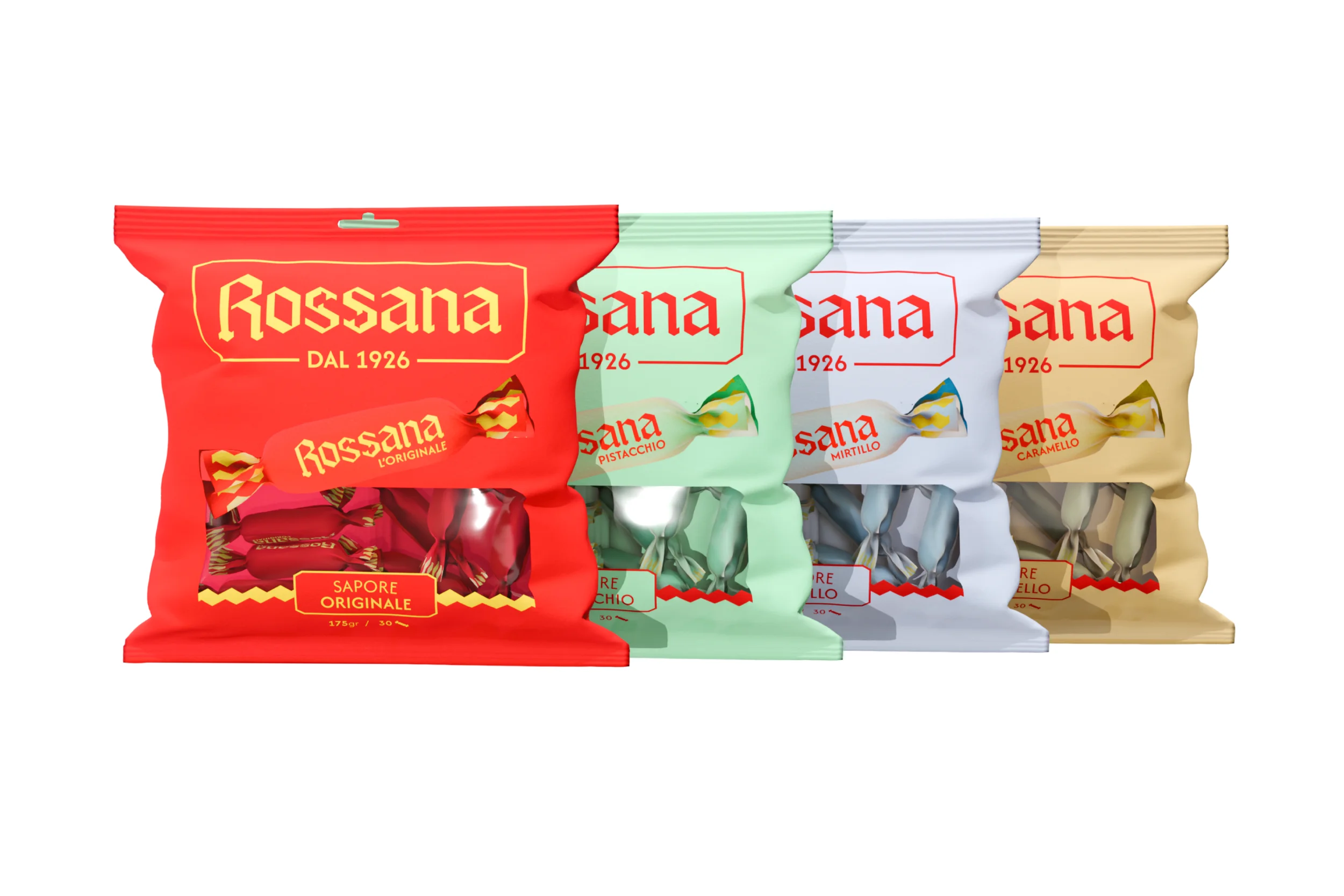
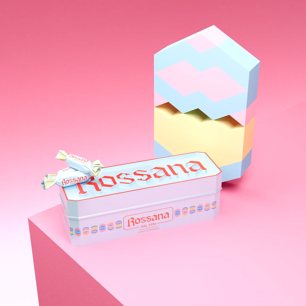
For Rossana - the hard candy with a soft heart that generations of Italians have enjoyed - this rebranding, developed as a team project, aims to echo the iconic shape, in a gesture of affection for new audiences, without losing its original hidden heart. My role centered on drawing the logo and developing the 3D design work throughout the project.
2025
Rossana
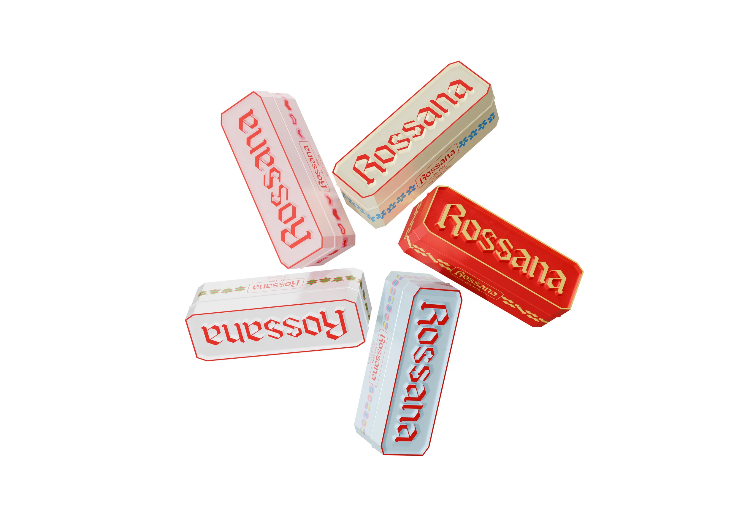
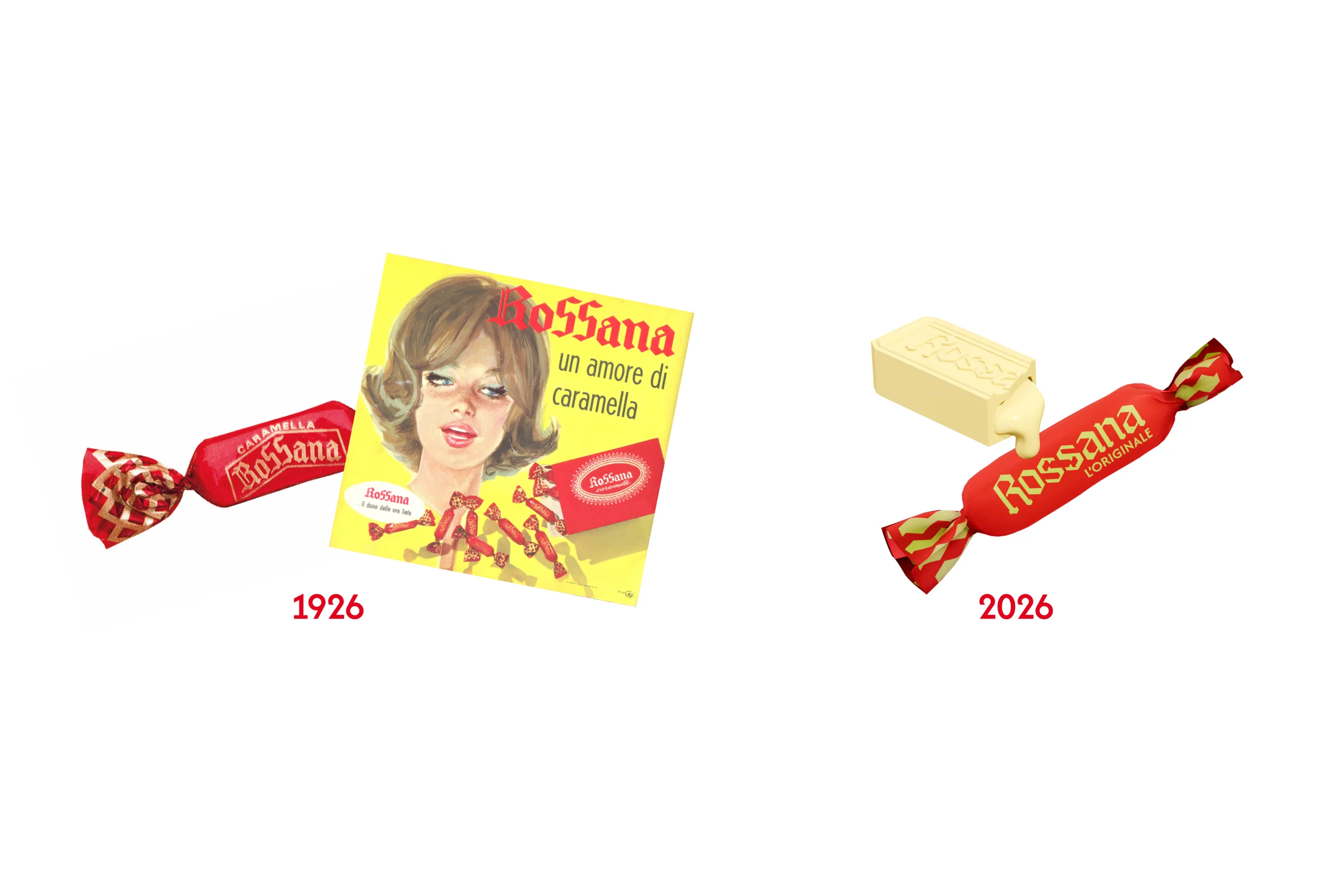
As a team, our rebranding for Rossana set out to modernise its identity without losing the bond with its heritage. The new visual identity system stems from the desire to strengthen recognition on the shelf as a heritage product, and communicate the candy not merely as a product, but as a small ritual of trust passed between generations.
The distinctive element is the stylised silhouette of the candy, integrated between the two "s"s of the logotype: a subtle yet memorable detail that becomes the brand's defining symbol. I drew this logo from scratch, researching gothic lettering conventions to keep the historic logo's neo-gothic soul intact while integrating the new silhouette. A new palette enriches the iconic red with options for new flavours that speak to the creaminess of the Rossana heart. New paper packaging shifts the tactile experience in store, welcoming a new generation of consumers.
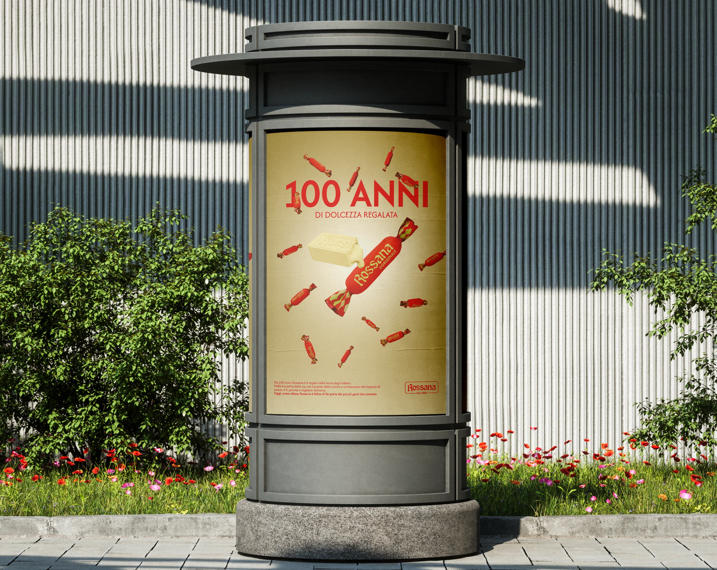
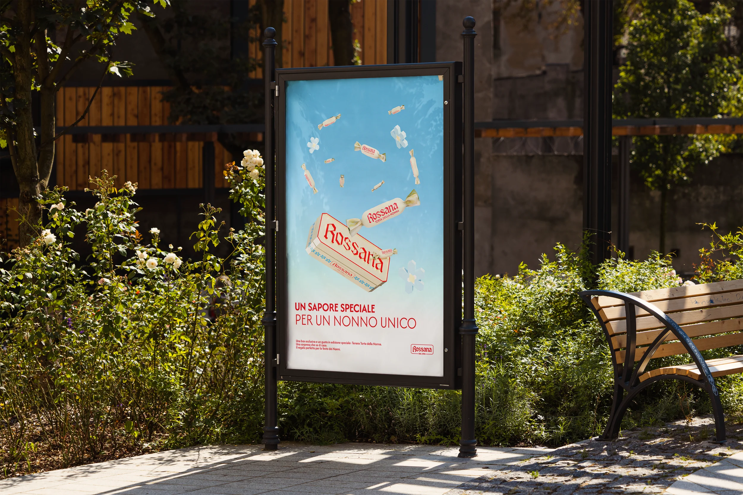
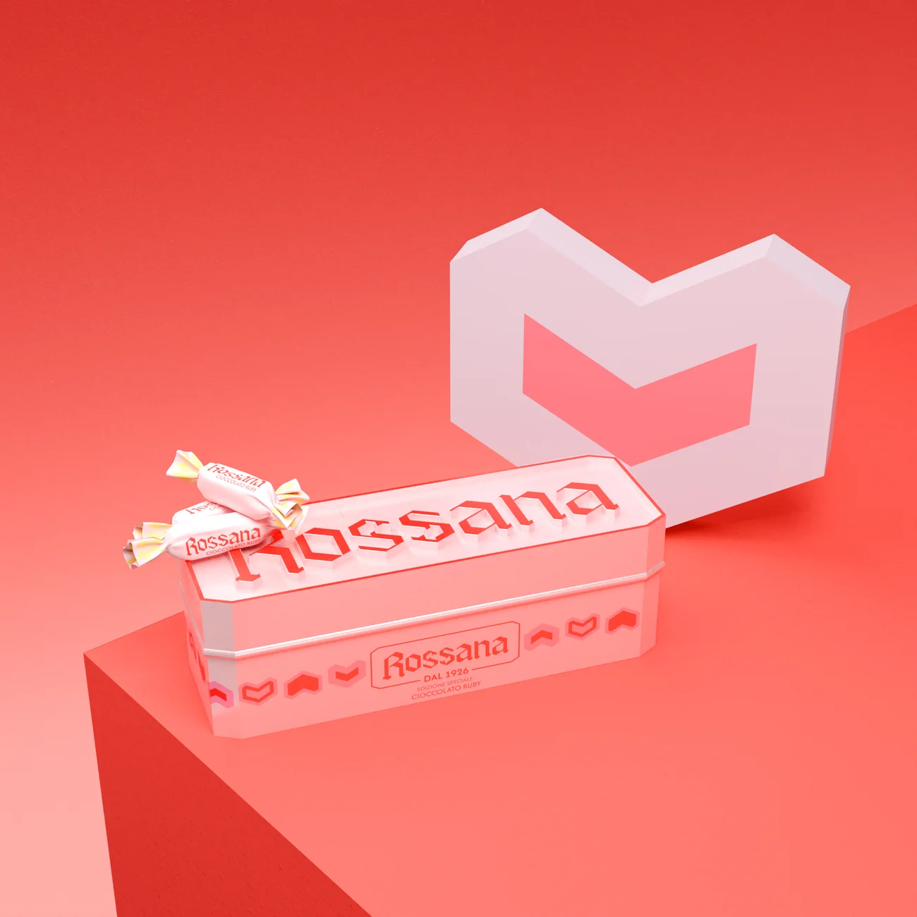
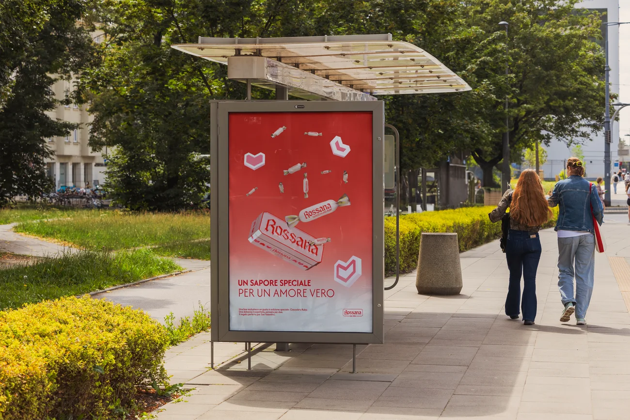
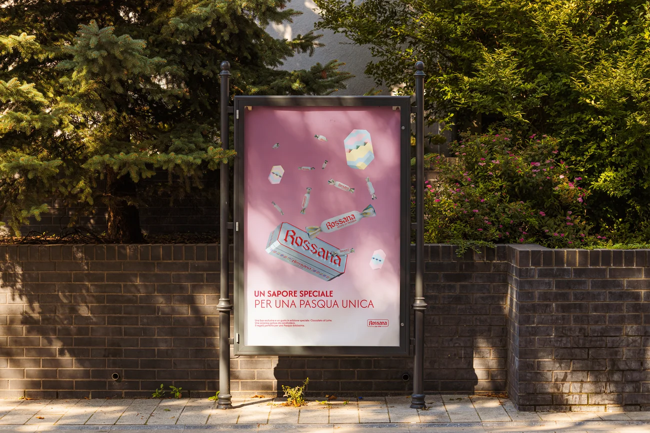
The campaign, developed together as a team, builds on a memory shared by almost every Italian: a loved one, usually a grandparent, passing a Rossana into your hand after your visit. This gesture is key to expand the meaning of gifting a Rossana as a gesture of love. This in combination with season limited flavors expands the brand's seasonal presence. The campaign encourages this intimate gesture by launching the limited flavours around key festivities, such as Grandparents' Day. I executed the 3D renders for the campaign posters and produced the final posters themselves.
Civiltà dei Dati
On the Brink
Client
Civiltà dei Dati, Fondazione Leonardo
Role
Information designer
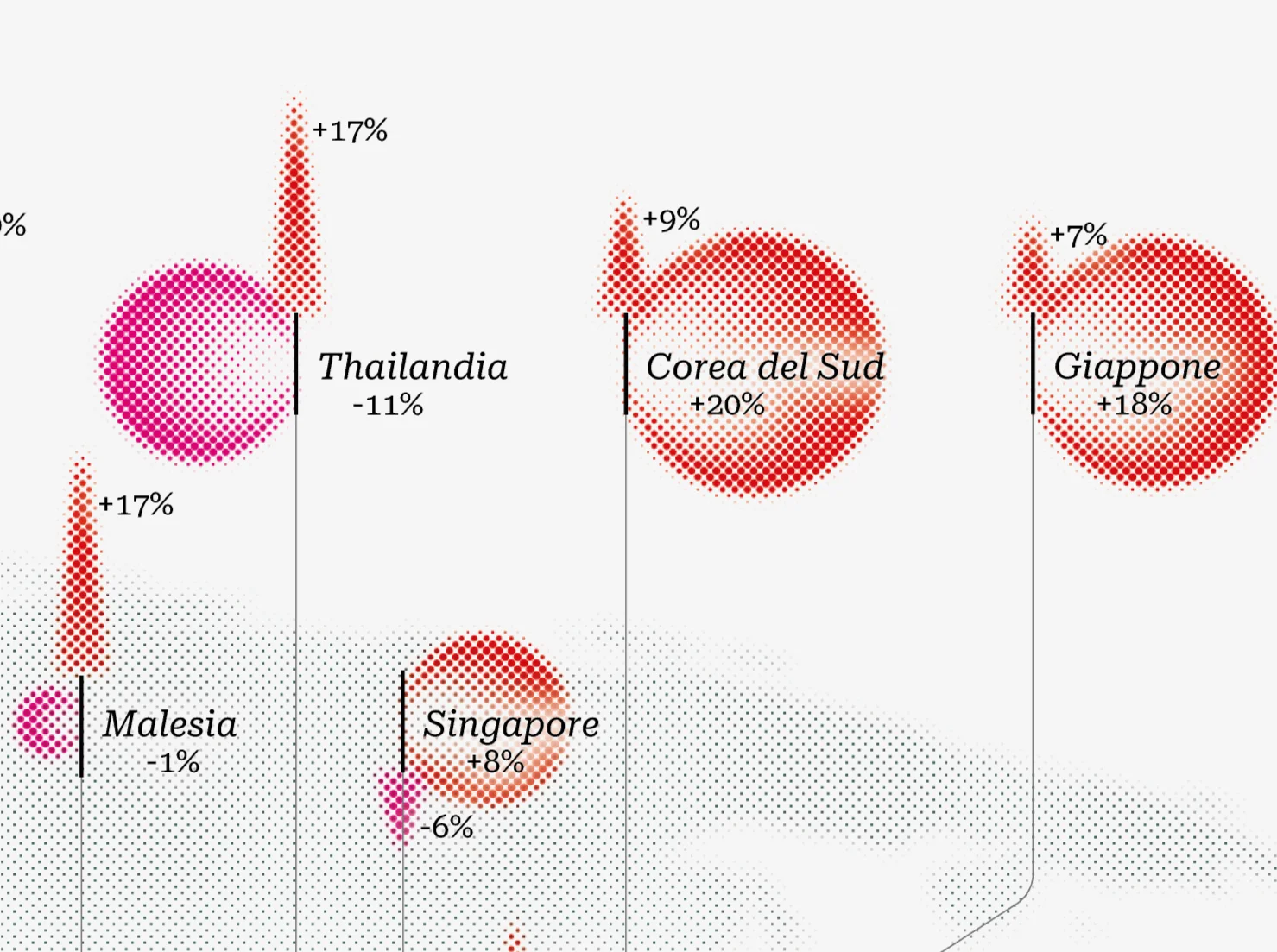
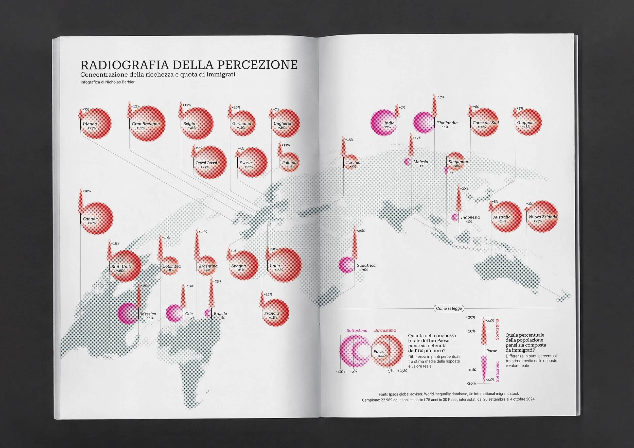
For the June 2026 issue of Civiltà dei Dati, focused on the perils of perception, the infographic centres on two data points that expose the gap between what people believe and what is real: the concentration of wealth held by the top 1%, and the perceived versus actual share of immigrant population by country.
The visual language draws from early radiography, as if the world itself were being held up to the light, each country examined like an organ, its issues laid bare beneath the surface. The map is rendered on a tilted sphere, the world captured as an imperfect, living body mid-scan, rather than a flat analytical projection.
2026
Civiltà dei Dati
Client
TEDxSapienzaU
Role
Digital design subteam leader, storyboarder, motion designer, visual identity design
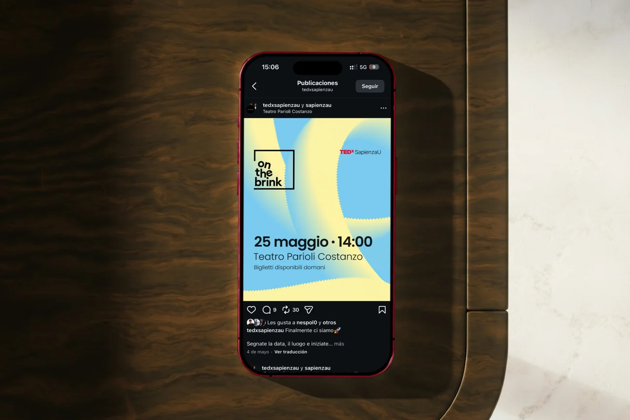
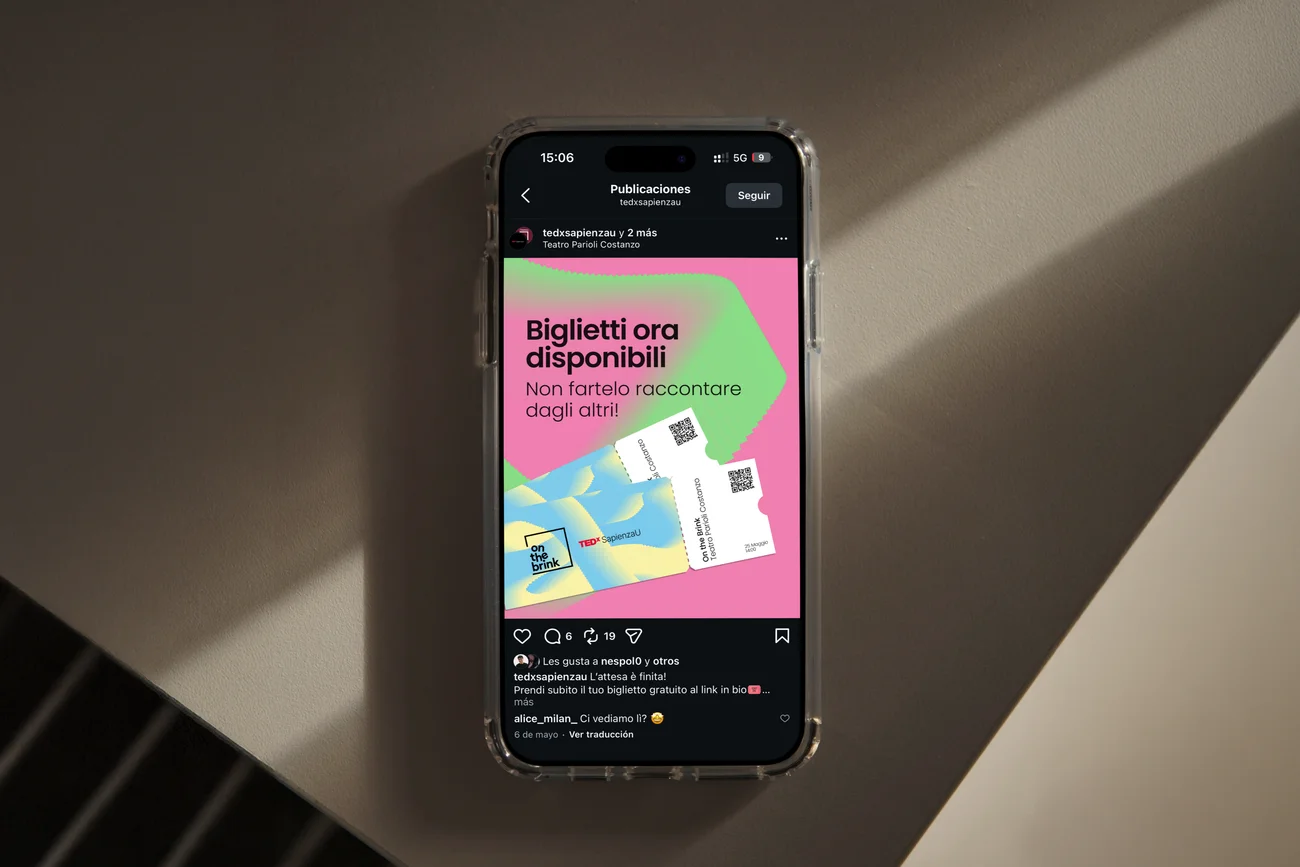
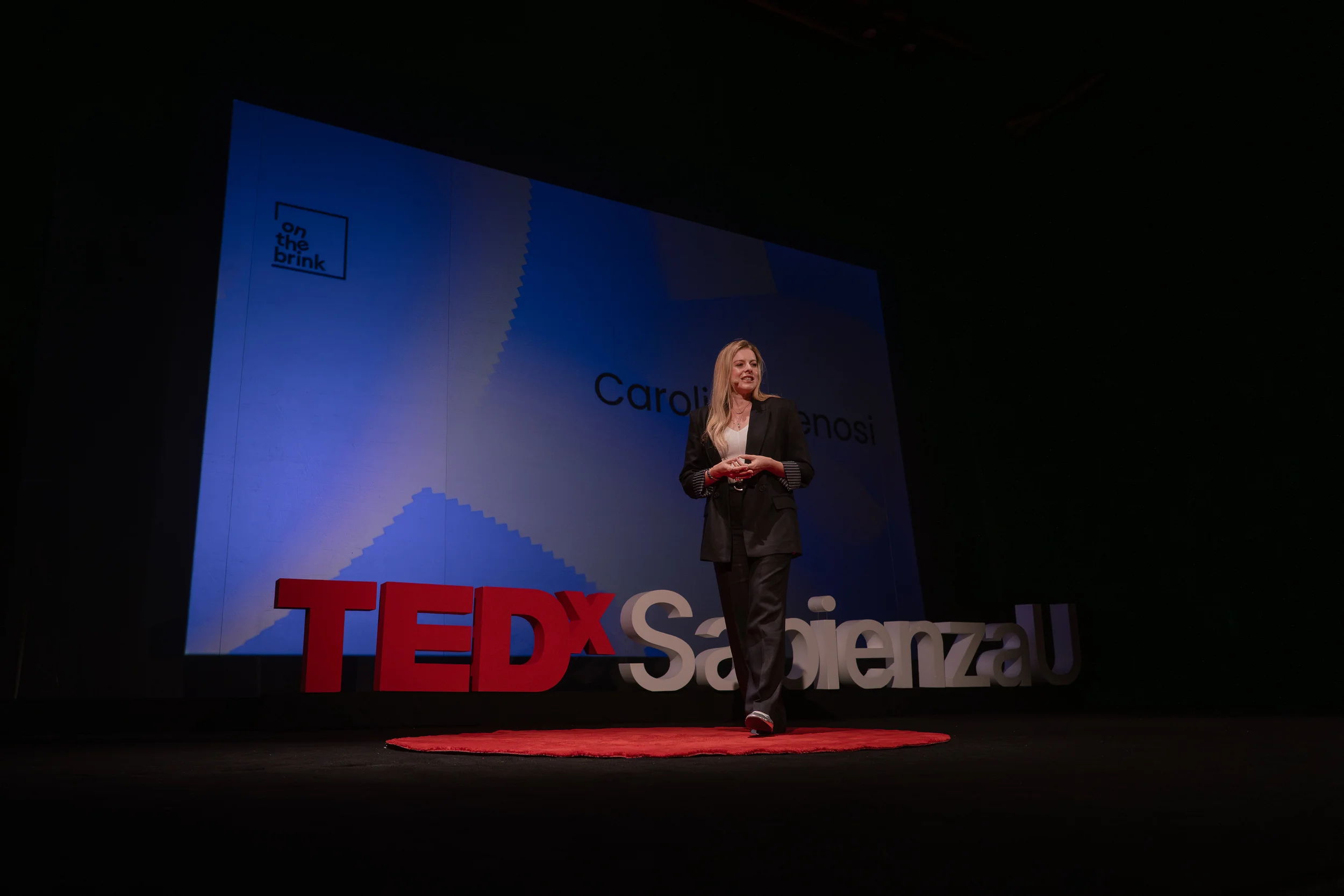
The intro video for TEDxSapienzaU - On the Brink was crafted to tell the story of the identity itself. A square, symbol of stability. Then the breaking point: the liminal, suspended "on the brink" moment, dense with possible futures. Then an explosion of repetitions in vibrant colours, each one representing a different possible scenario. Designed to pull the audience into the theme before the first speech begins, both in the theatre and on YouTube.
I came up with the initial concept and storyboarded the full sequence. I animated the first half myself, worked with another animator on the second half, then edited and cut together the final video.
2026
On the Brink
Para Doxa
AperiPrinting
Client
TEDxSapienzaU
Role
Digital design subteam leader, concept creator, visual identity design, digital designer, motion designer
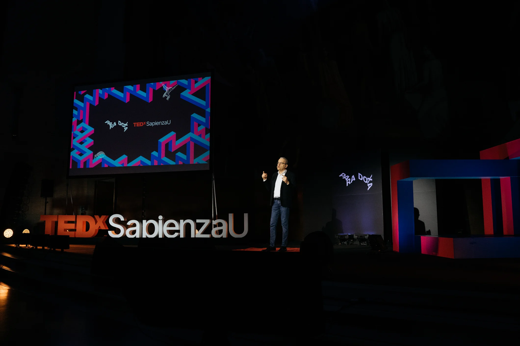
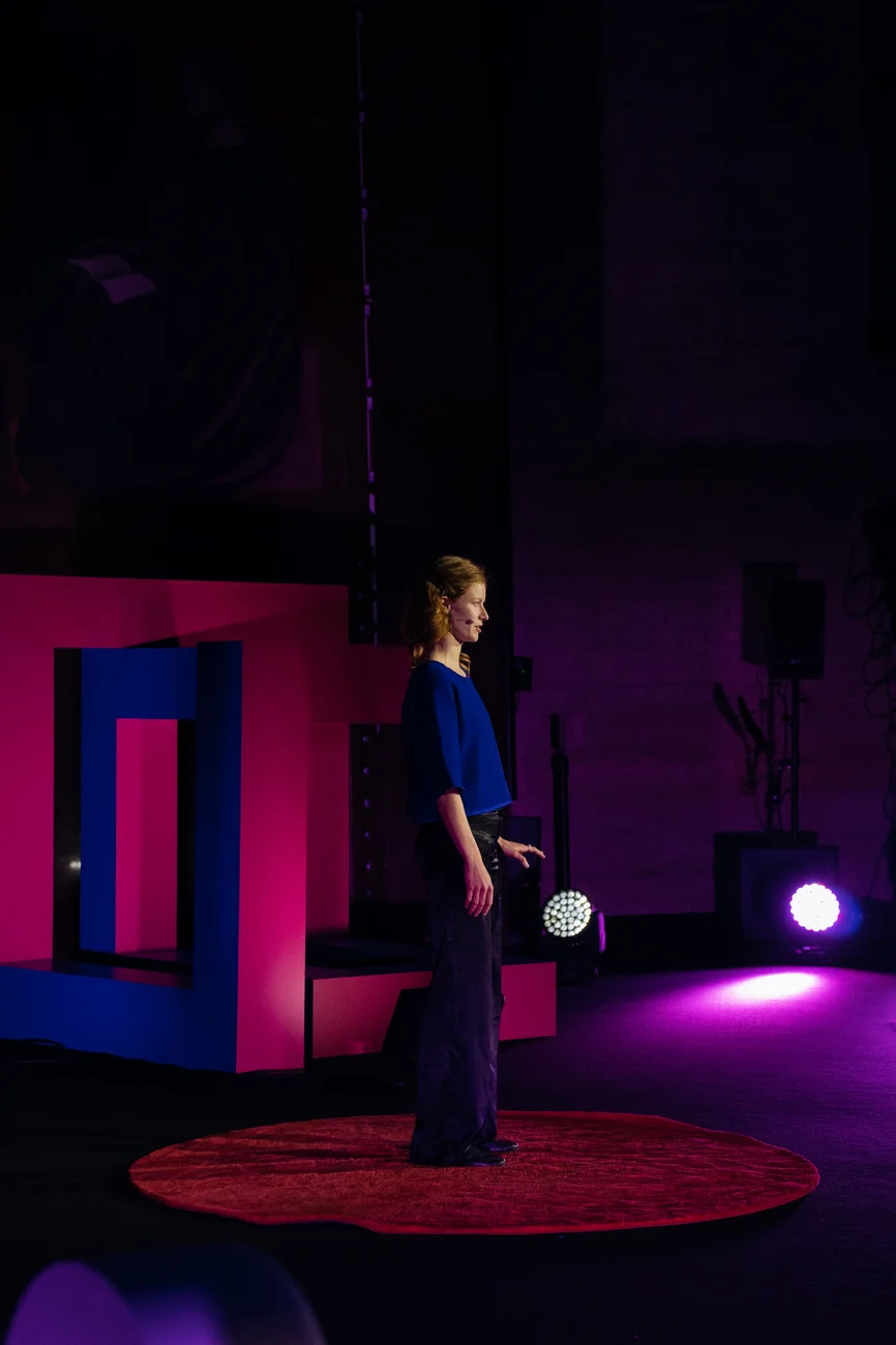
As digital design subteam leader for TEDxSapienzaU's April 2025 edition, Para Doxa, I originated the concept, competing against and being selected over other ideas proposed by the team. The visual identity was born with the goal of building a visual language immediately recognizable as belonging to the world of paradoxes, speaking directly to the event's primary audience of university students. I then led its development as a volunteer, coordinating a 5-person digital design subteam and directing key decisions such as color palette and typography. I was responsible for all screen graphics on the day of the event and all digital media beforehand, spanning social media, newsletters, and animations. After the event, I also oversaw the storyboarding and production of the intro animations for the talk recordings published on the official TEDx channel.
2025
Para Doxa
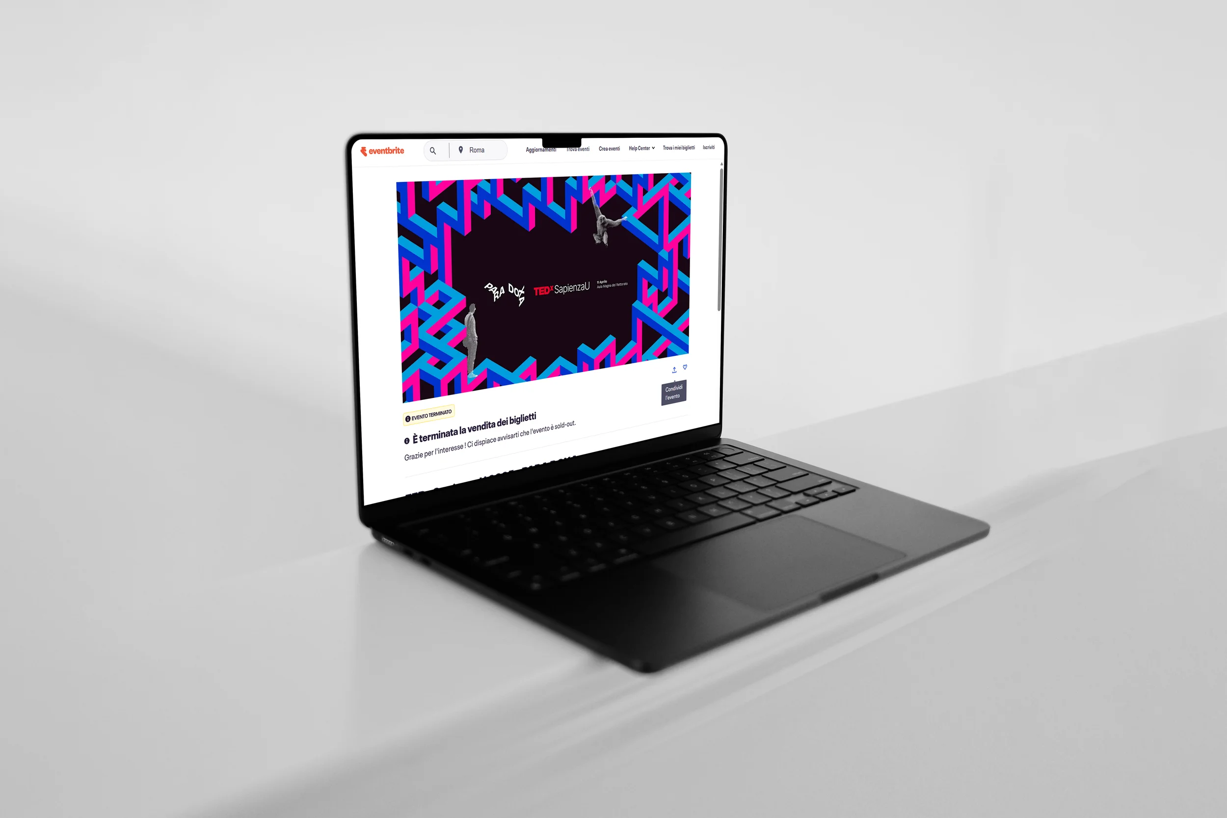
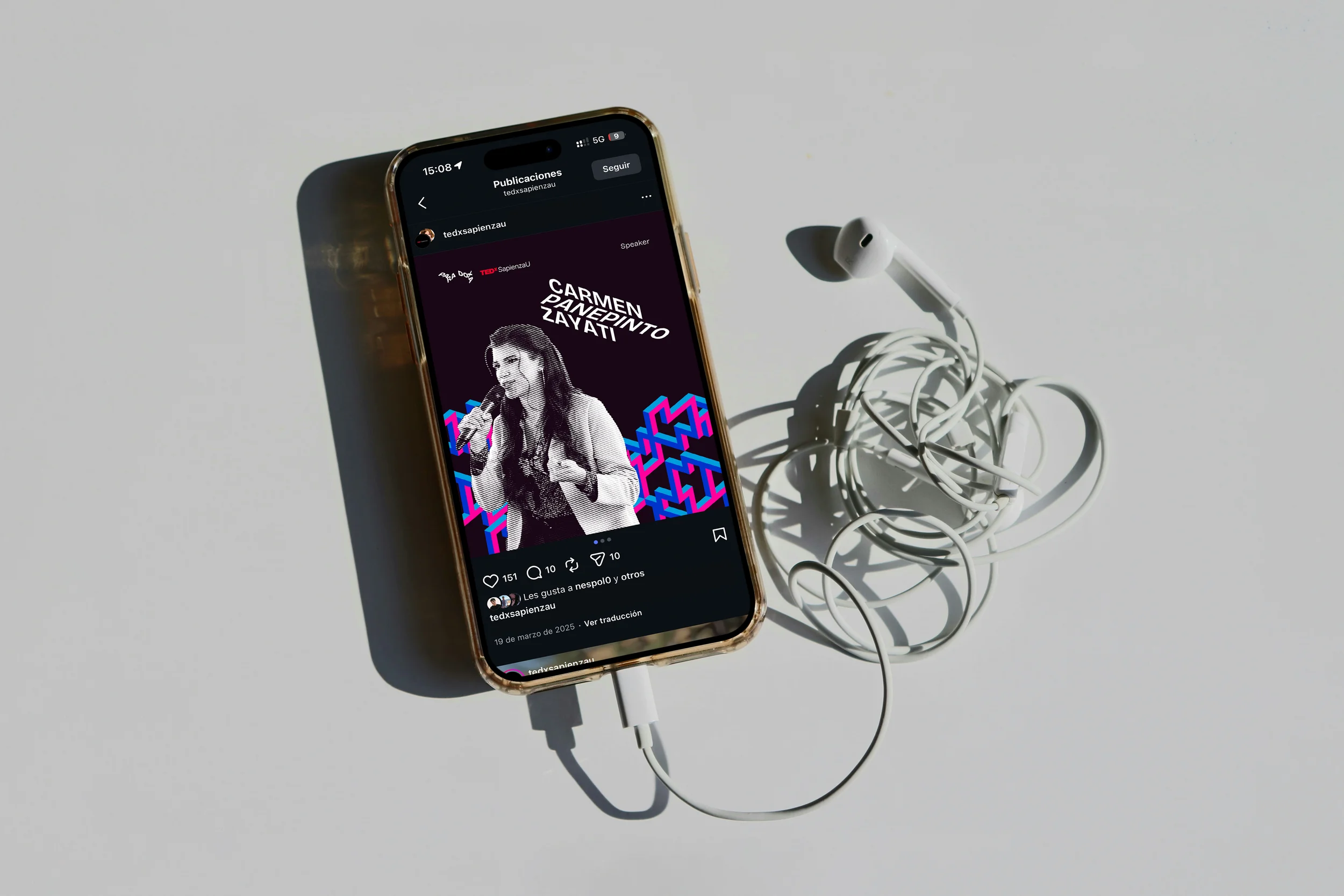
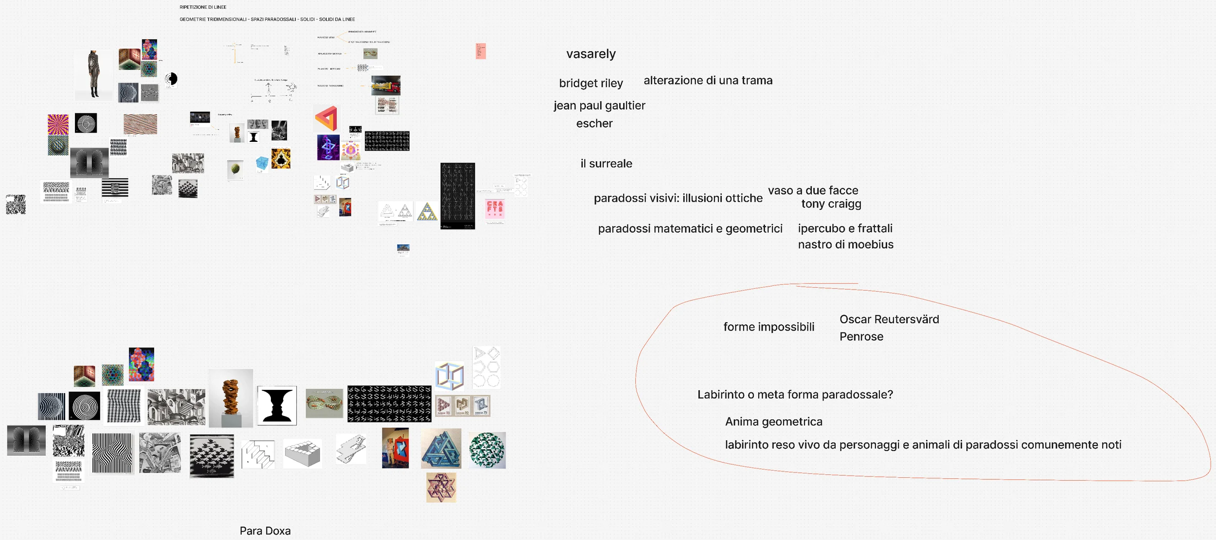
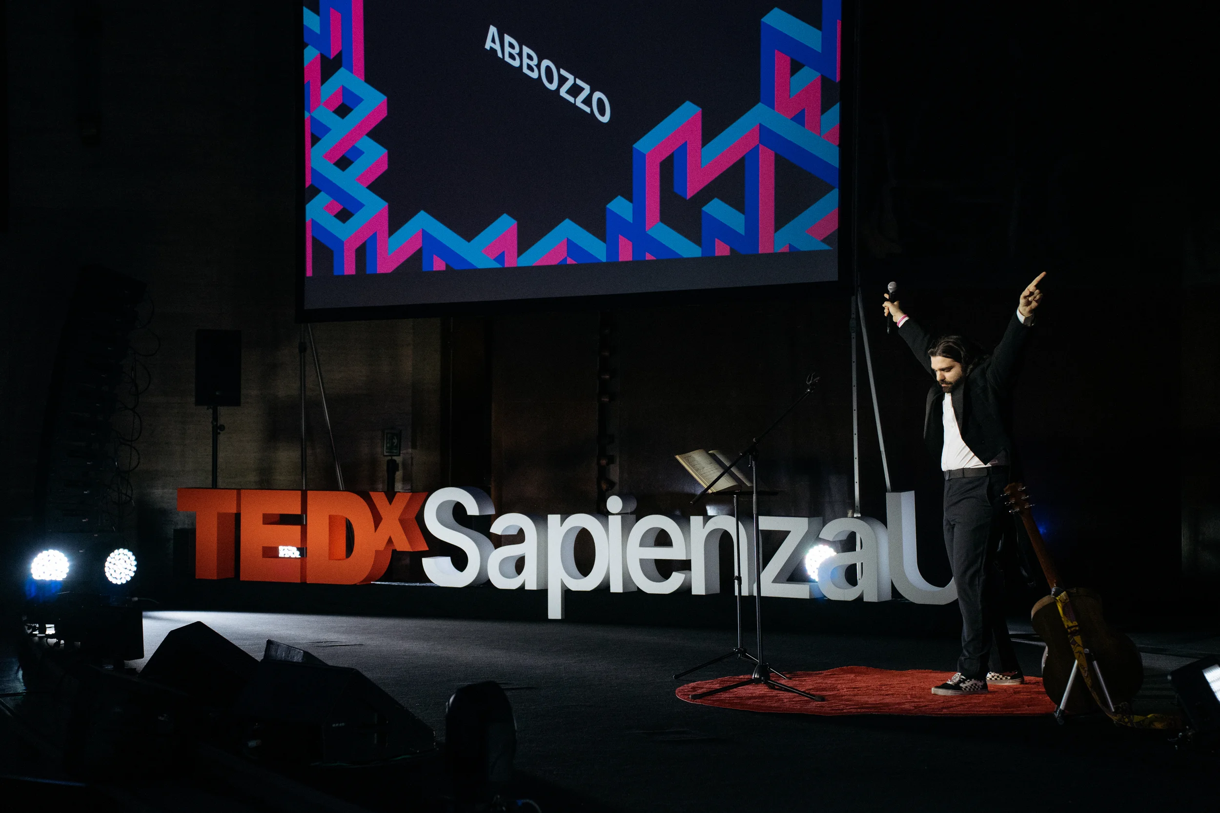
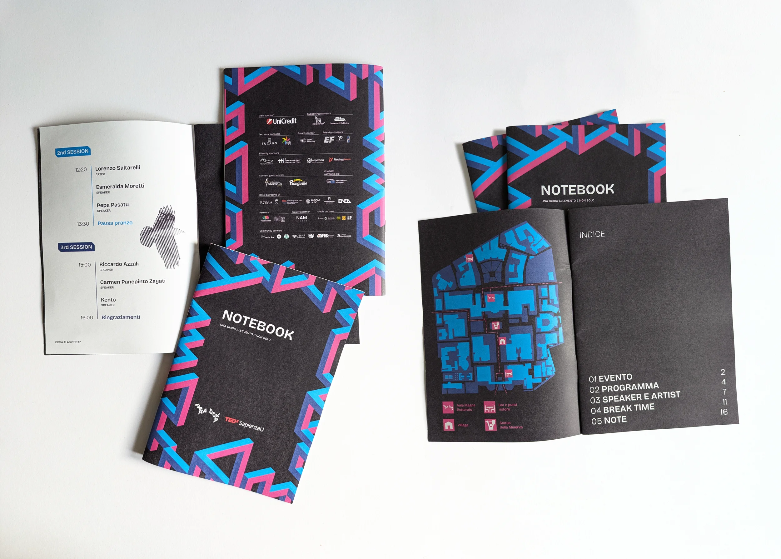
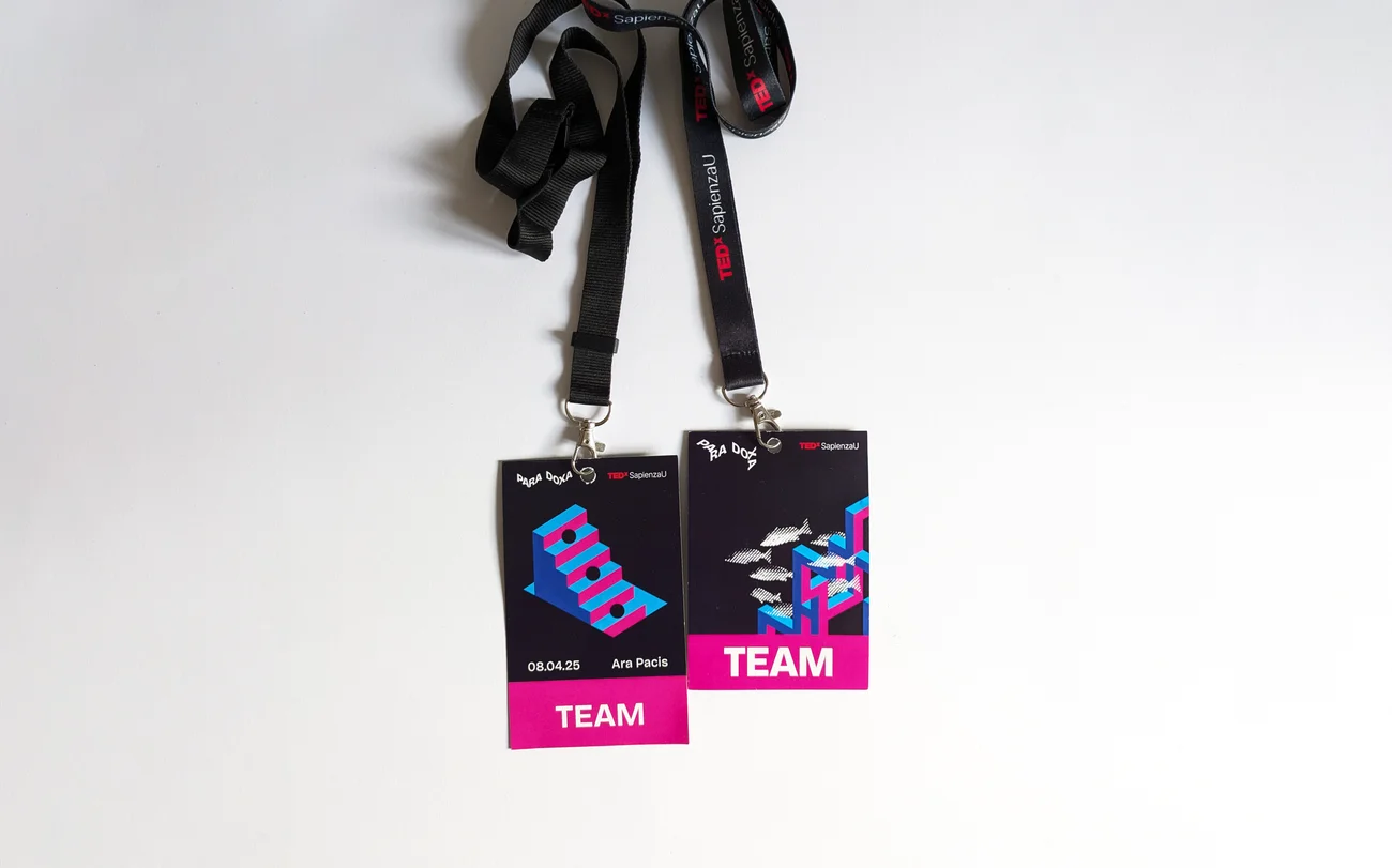
The concept draws from the impossible shapes of Penrose and Reutersvärd, reimagining them as an impossible labyrinth, a space where geometric rules bend and give rise to the key artwork of Para Doxa. The strict isometric geometry of the labyrinth acts as a dynamic framework for a logo that is ever-changing yet always coherent, reflecting the ability to hold multiple perspectives at once, just as every paradox brought to the stage does. Inhabiting the labyrinth are images of people and animals, each representing a different paradox, an easter egg for those able to recognise them.
These figures are treated with a halftoning effect inspired by Escher's xilographies, producing a monochromatic imagery that complements the colourful labyrinth. The same geometric logic extends to the typography, with words distorted along the isometric angles of the labyrinth, most notably in the logo and in key titles such as the speaker cards.
Client
TEDxSapienzaU
Role
Event concept, organization, illustration
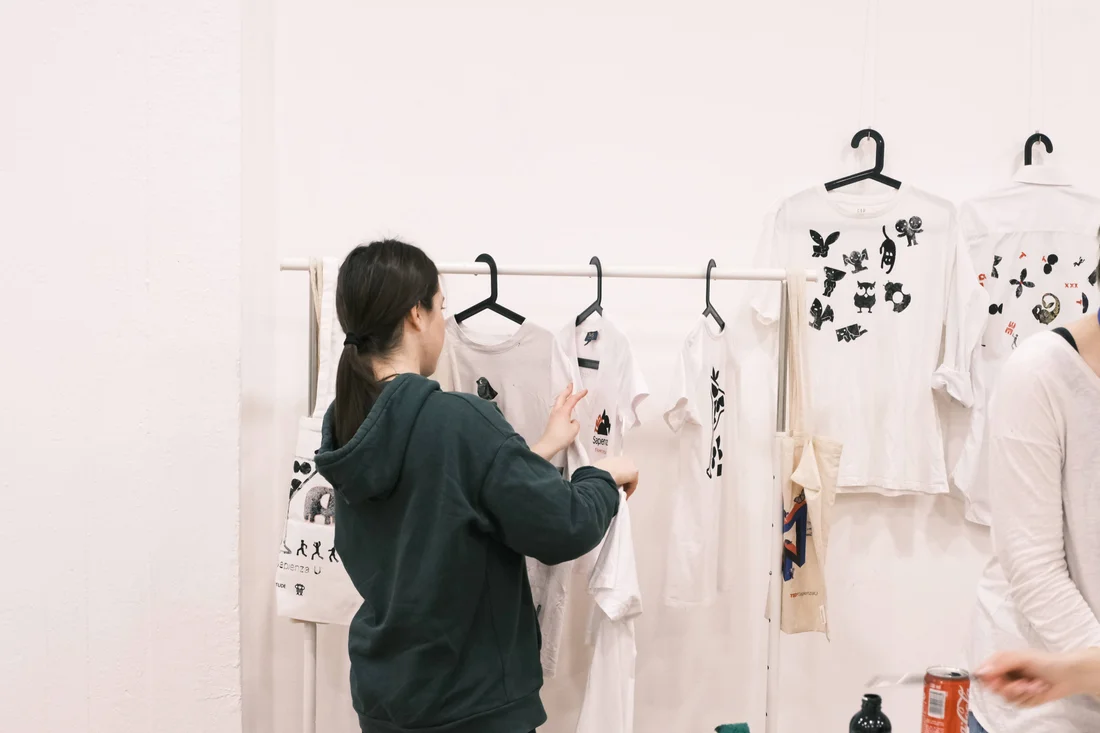
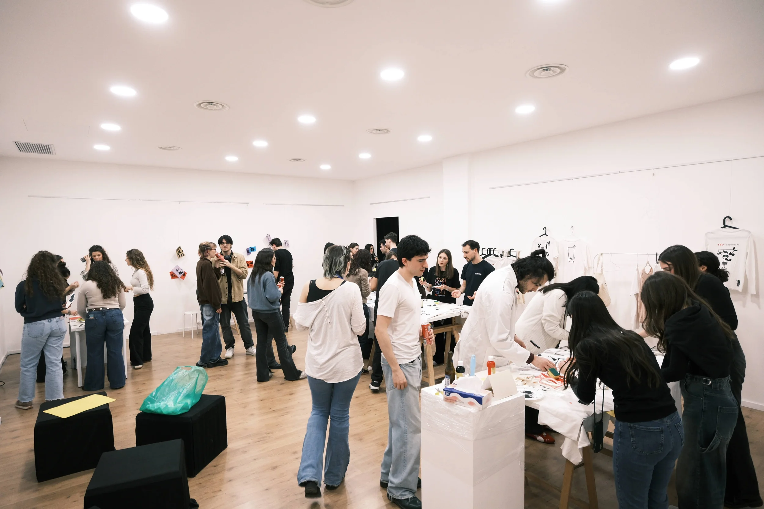
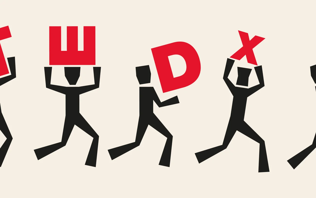
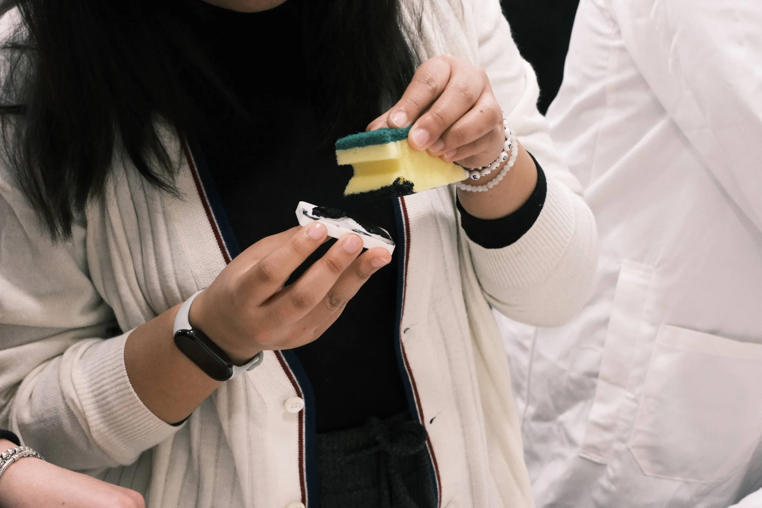
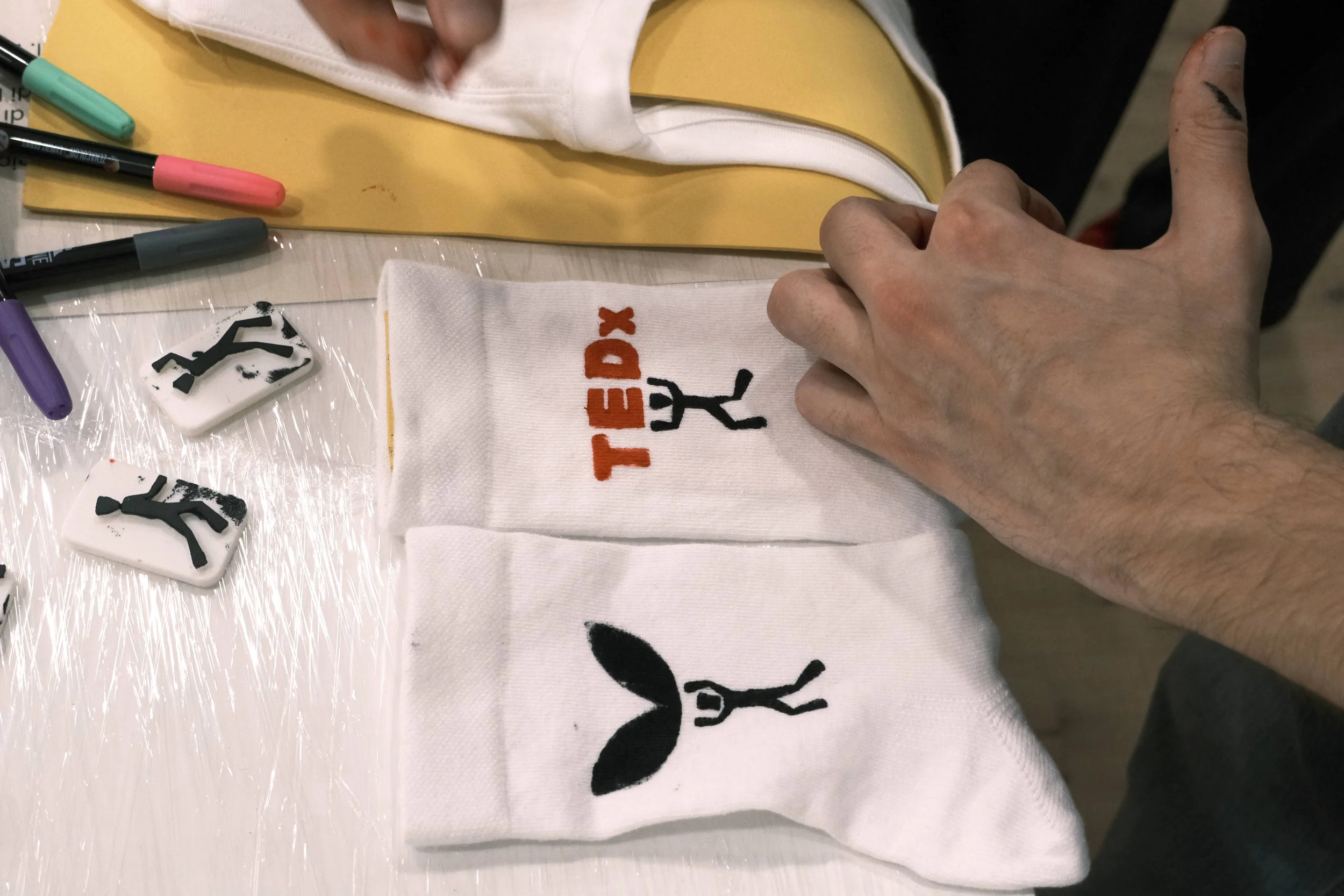
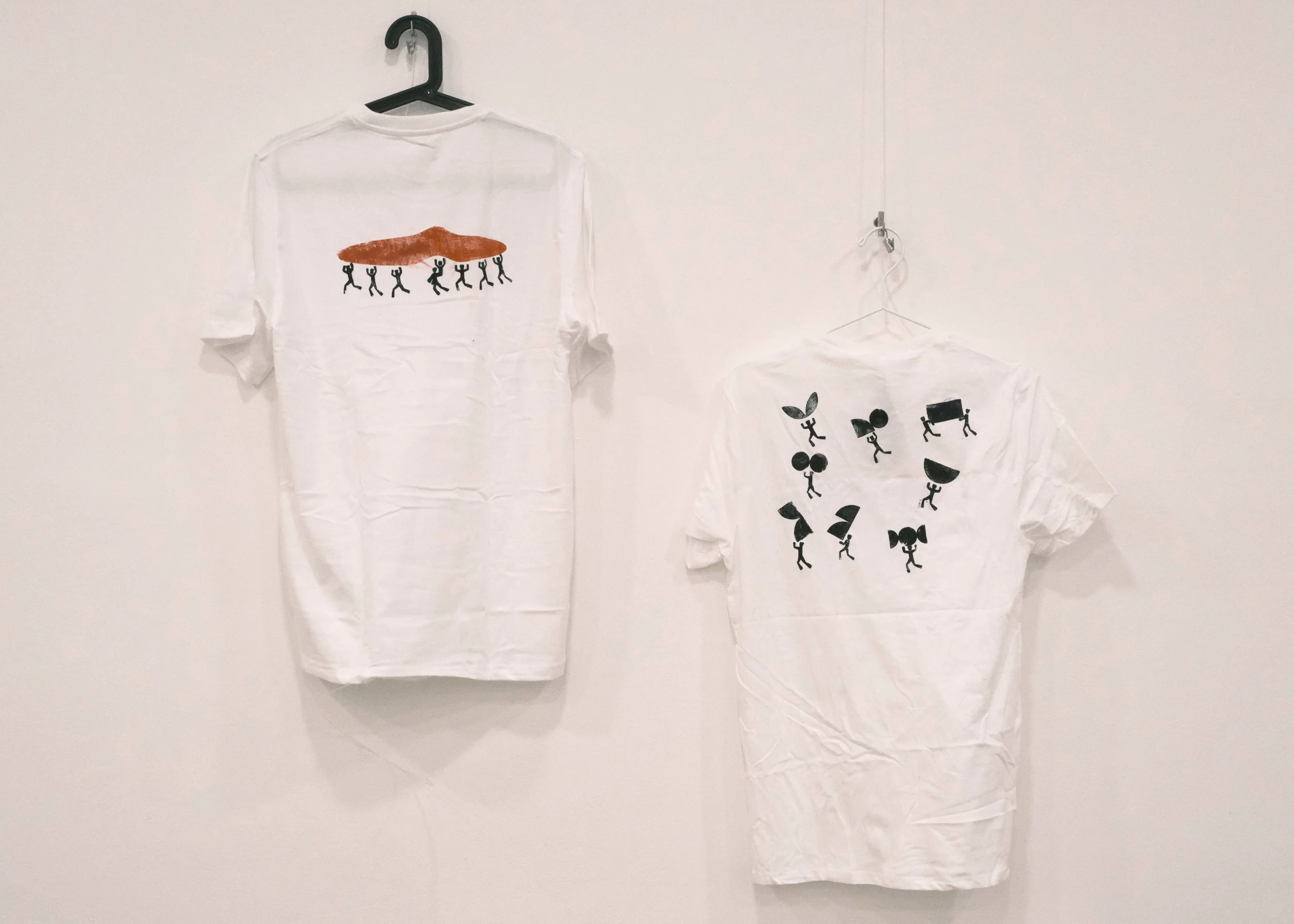
AperiPrinting was an event I conceived, designed to let TEDxSapienzaU's community, followers and volunteers alike, create their own dream merch, in a fun, accessible and lighthearted way. I originated the concept; organizing it from there was a group effort, involving decisions ranging from large-scale experience design down to the printing method: 3D-printed stamps, chosen for their accessibility in cost and ease of use. Beyond the association's logos, the team designed four illustration sets, each representing a different theme, which participants could freely combine into their own composition. I personally designed the set capturing the rhythmic, chaotic dance of event setup, something anyone who has ever volunteered for an organization like this knows deep in their bones.
2026
AperiPrinting
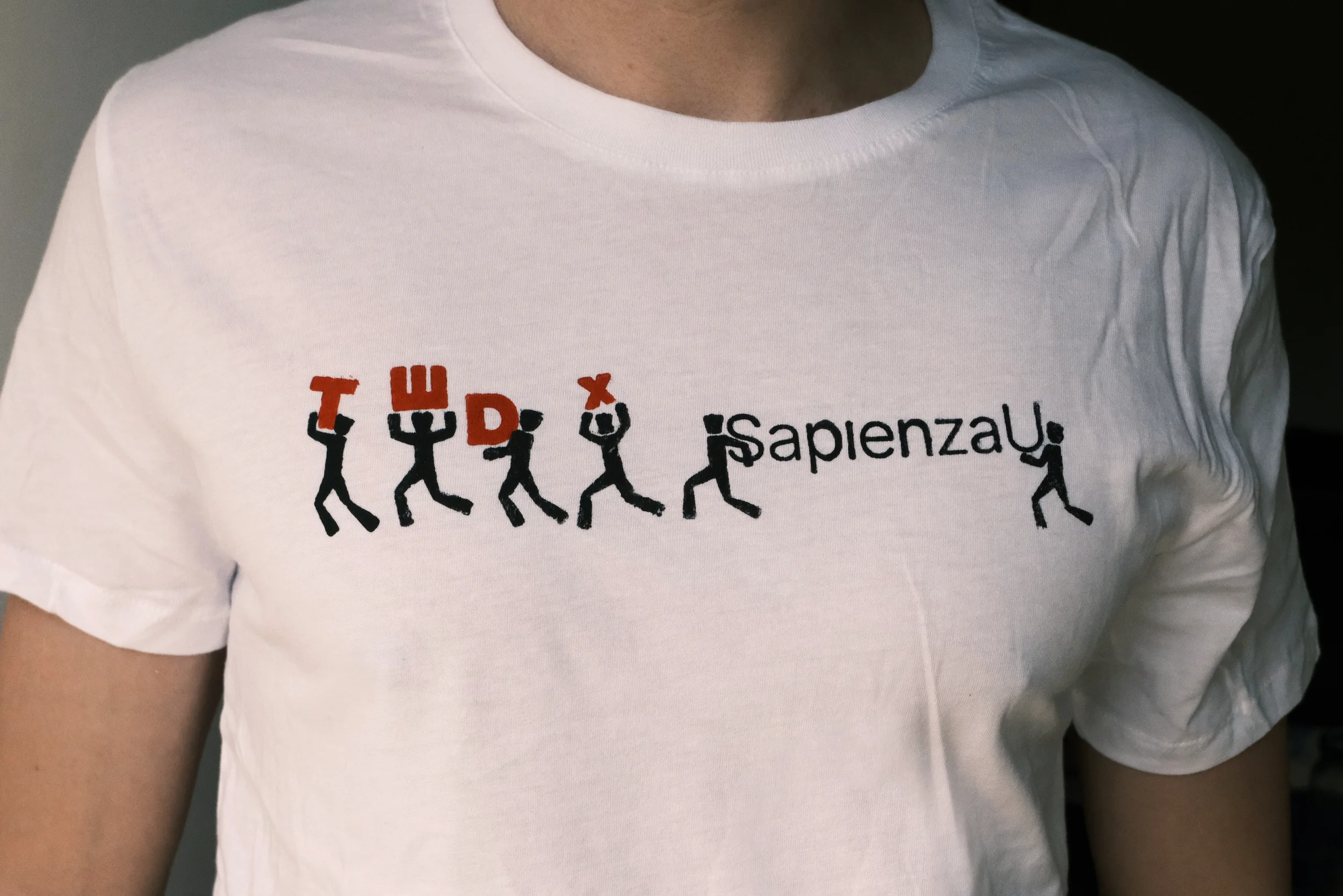
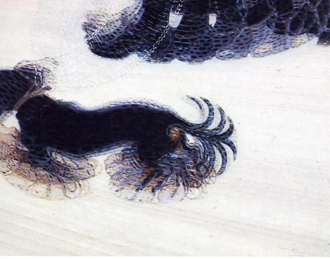
The figures are abstract and geometric so to be easily printed, but expressive in their dynamic positions. Their peculiarity comes from the widening limbs at the end, which inspired by futurism artworks such as Dinamismo di un cane al guinzaglio by Giacomo Balla, enhances the perception of movement of the limb.
Who am I?
Good question! I'm Nicholas, an italian designer studying and working in the fields of visual communication and motion design.
For me every project is a way to teach myself something new about design and the world. Experimenting with new tools and approaches is how I keep trying to improve my work. My latest obsession is browser based coded tools and approaches, feel free to take a look at some of my experiments on my instagram (@nespol0). One result of this experimentation has been the identity for Prendersi Cura, which utilizes a p5.js tool to create all the visuals for the collective.
This experimentation has allowed me to go beyond the traditional classroom experience at Sapienza, as I try to learn approaches that put motion design at the forefront of developing dynamic and parametric identities.
Got a project that could use some of this experimentation?
Let's email! ↗Experience, Awards & Publications
2024-current ○ Design, Multimedia and Visual Communication master, Sapienza
2024-current ○ TEDxSapienzaU, digital design subteam leader - leading a 5-person team within a 20-person design department, part of a 100+ person volunteer organization
2026-current ○ Sambre Collective, visual communication designer
2026-2026 ○ Civiltà dei Dati, information designer, internship
2025 ○ Award & Project exhibited, Design&Territori - Brand Design Strategy for Tetide, Umbrella Brand of Puglia Parks
2025 ○ Publication, "Trovarsi tra i ruderi: dal Grand Tour all'urbex, alla ricerca dell'identità", Publica Press GRAF_I DOI:10.82048/202502